Recipe Hub
Cooking Up the Perfect Beginner Recipe App
It can be difficult for people learning to cook to find recipes suitable for their skill level and correctly shop for what they need.
Recipe Hub is a recipe app that prioritizes beginners and those needing extra help. It has advanced recipe filtering, ingredient shopping integration, additional tips and instructions, and the ability to find progressively more advanced recipes as the user becomes more comfortable in the kitchen.
I worked as the lead UX researcher and UX designer for this project. Additionally, background research was executed in a team environment, and personas were provided before the design development.
Background
Industry Trends
This report combines information from various sources to provide a comprehensive overview of the recipe apps market. Here’s a breakdown of key findings and insights:
Market Growth and Size
The global recipe apps market is growing rapidly due to smartphone use, internet access, home cooking trends, and increased health awareness.
Market Opportunities
Recipe apps are evolving with IoT and AI integration, offering personalized features and culturally tailored cooking experiences for diverse regional preferences.
Market Segmentation
Free mobile recipe apps dominate; Android leads globally. North America leads the market, and Asia Pacific grows fastest regionally.
Market Challenges
Economic limits and intense competition challenge paid recipe apps, especially in regions with low smartphone penetration and high price sensitivity.
Regional Variations
While the global market is growing, there are regional variations in preferences, app usage patterns, and market penetration.
Emerging Trends
Recipe apps are evolving with health-focused content, AI personalization, subscriptions, social features, and smart kitchen integration to meet modern cooking needs.
Competitive Analysis
I created a chart comparing various features between apps
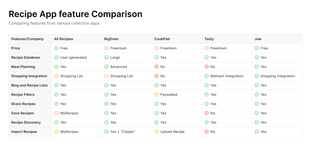
General Observations:
- Required Features: Search function, recipe saving, recipe recommendations
- Expected Features: User-friendly UI, personalization, social sharing
- Desired Features: Grocery integration, dietary preference settings, meal planning tools, smart appliance integration
- User Interface: Preference for bottom navigation bar, easy sorting, and advanced filtering.
- Format: Focus on phone and tablet optimization.
Additional Notes:
- User research is key to prioritizing desired features.
- Potential value-adds include a recipe cost calculator, a nearby grocery store search, and voice control.
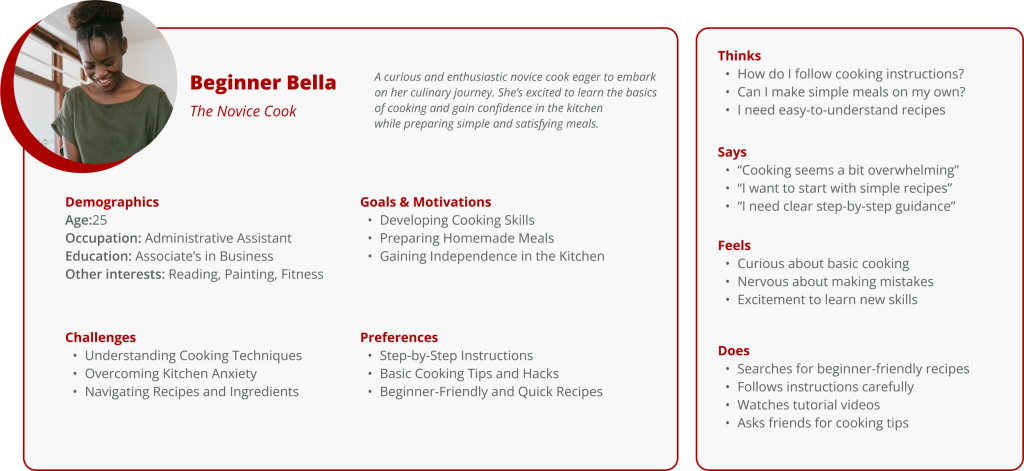
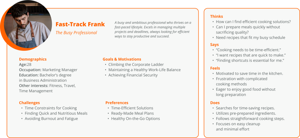
User Personas
In addition to beginners who need extra guidance, I also decided to consider those who are busy and need some help saving time in the kitchen, since many of the needs overlap.
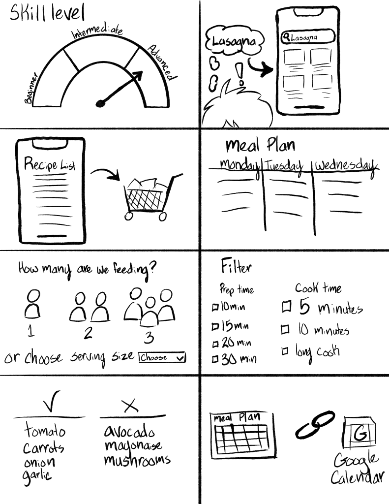
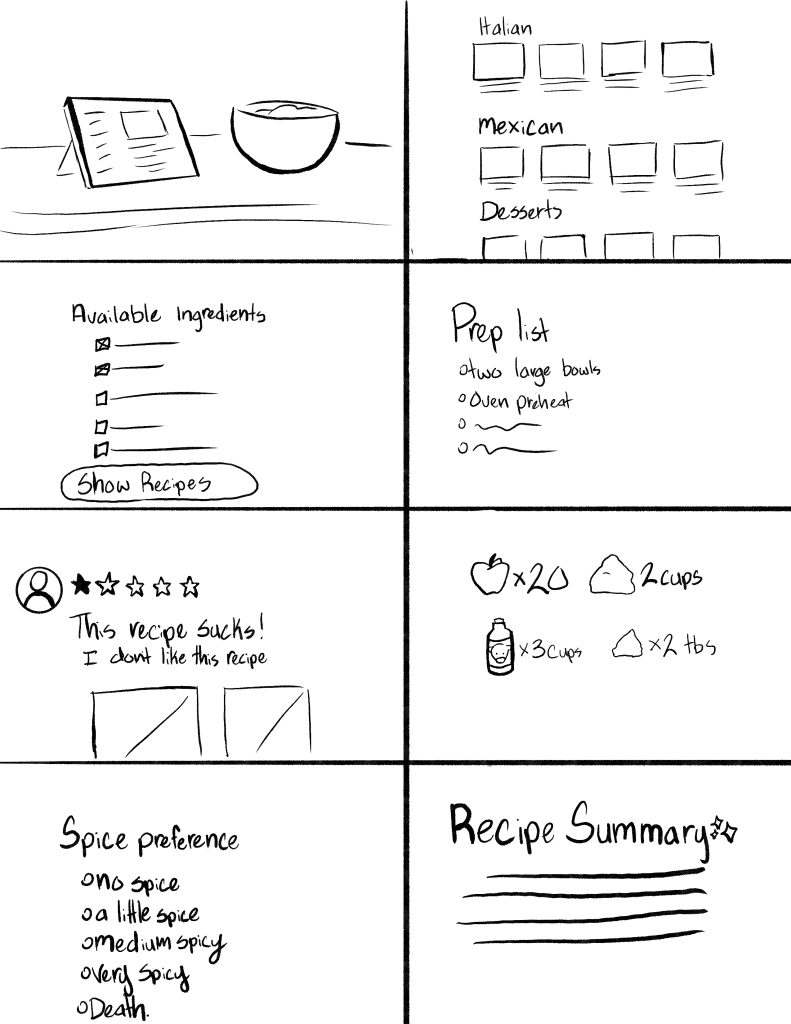
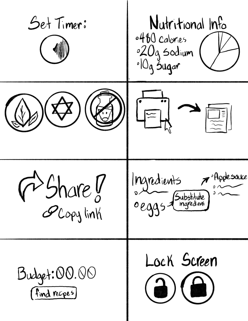
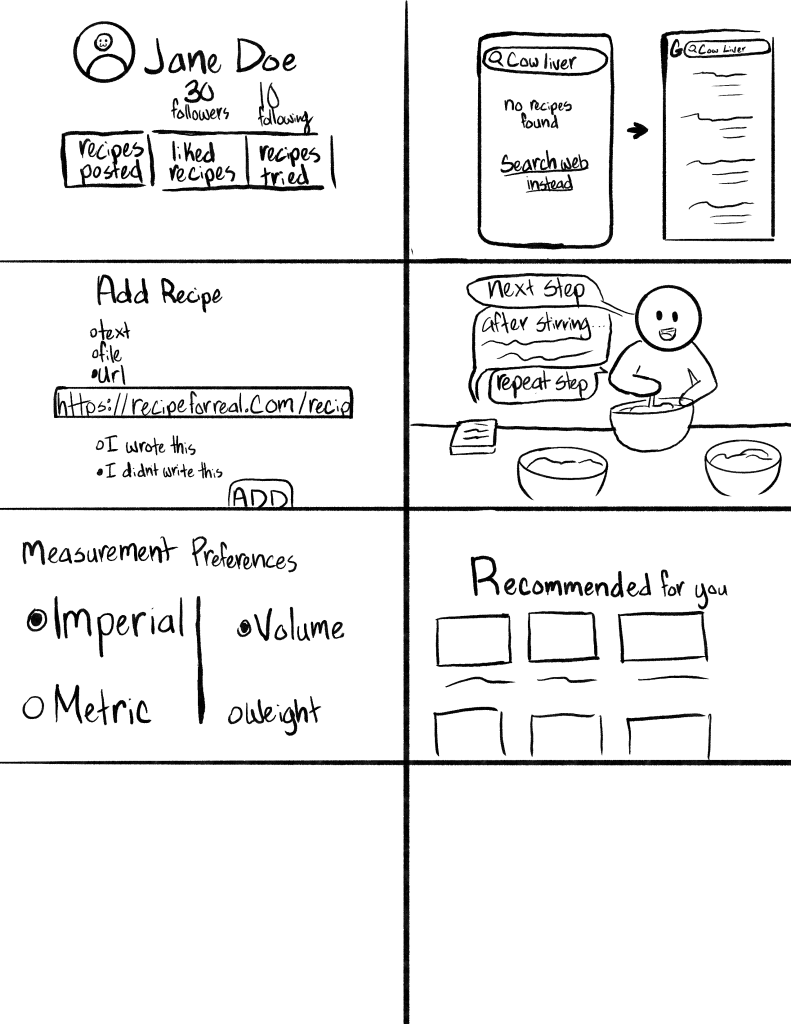
Design Ideation
Task Function/Ideation Sketches
I explored various potential features in a series of sketches.
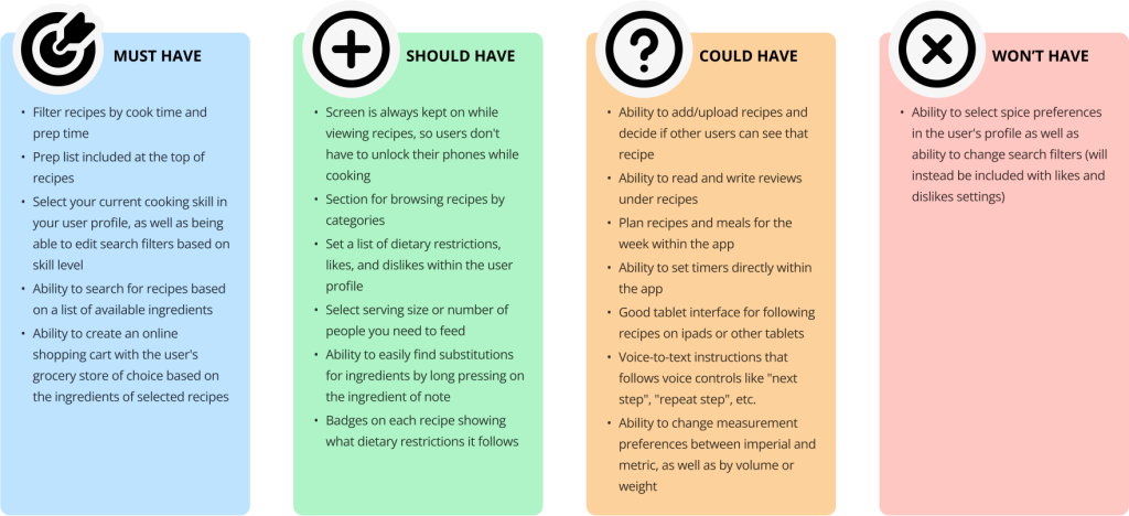
Feature & Function Prioritization
After exploring potential features, I performed a MoSCOW analysis to prioritize which ones to focus on.
I then mapped out inputs and outputs for the app.
Input
- Preferred prep and cook time: Users will be able to filter their recipe searches and browsing by preferred prep time and cook time
- User’s skill level: Users will be able to select their skill level in their user profile
- Available ingredients: Users will be able to search for recipes based on a list of available ingredients
- Dietary restrictions and likes/dislikes: Users will be able to select their dietary restrictions as well as any likes/dislikes they might have in their profile, and they will also be able to edit search filters with this information
- Search terms: Users will be able to type into the search bar of the recipe app to find recipes that match with their search term
- Voice commands: Users will be able to use voice commands to control the text-to-speech recipe instructions
Output
- Recipe search results/browsing: The recipe app will show various recipes on the home page in categories for browsing, as well as recipes that come up in search results
- Shopping cart based on ingredients from recipes: The app will be able to generate a shopping cart integrated based on ingredients from a selection of recipes, integrated with the user’s preferred grocer
- Voice to text recipe instructions: The app will be able to read out recipe instructions out loud for the user to listen to as they work
- Ingredient substitutions: App will be able to generate a list of possible ingredient substitutions
- Prep list for recipes: App will provide a list of things users need to do before they start cooking/what materials they should get out
App Name Development
To help decide on a name for the app, I surveyed to gather insight on how various names are perceived.
The survey tested the names “EasyEats”, “Cookit”, “PantryPal”, “Cook Savvy”, “Dish Delight”, “Pretty Plates”, “Cibusly”, “Recipe Hub”, and “CookBox.”
I chose “Recipe Hub” for the name, since participants found “Recipe Hub” most reliable, helpful, and intuitive.
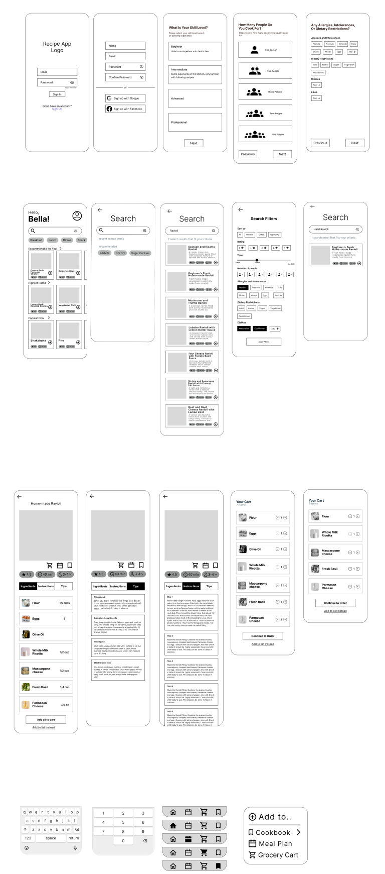
Low-Fidelity Prototyping
I drafted rough prototypes in Figma and separated the pages and components.
User Testing of Paper Prototypes
The set of prototypes was tested to:
- To determine design inconsistencies and usability problems within the user interface and content areas. Potential sources of error may include:
- Navigation errors – failure to locate functions, excessive keystrokes to complete a function, failure to follow recommended screen flow.
- Presentation errors – failure to locate and appropriately act upon desired information on screens, selection errors due to labeling ambiguities.
- Control usage problems – improper toolbar or entry field usage.
- Exercise the application or website under controlled test conditions with representative users. Data will be used to assess whether usability goals regarding an effective, efficient, and well-received user interface have been achieved.
- Establish baseline user performance and user-satisfaction levels of the user interface for future usability evaluations.
Task Development
When developing the tasks for the user testing, I initially had a much more elaborate set of functions. I hoped to have the stills for all pages designed in time for user testing. However, this was an unrealistic goal I had set for myself. I was initially going to include using the meal prep features in the testing, but that screen was not designed in time.
This was for the best, as focusing the first set of tests on the main core features and basic navigation is better because it allows for user insight to be considered when designing other features. This saves time and requires less user testing.
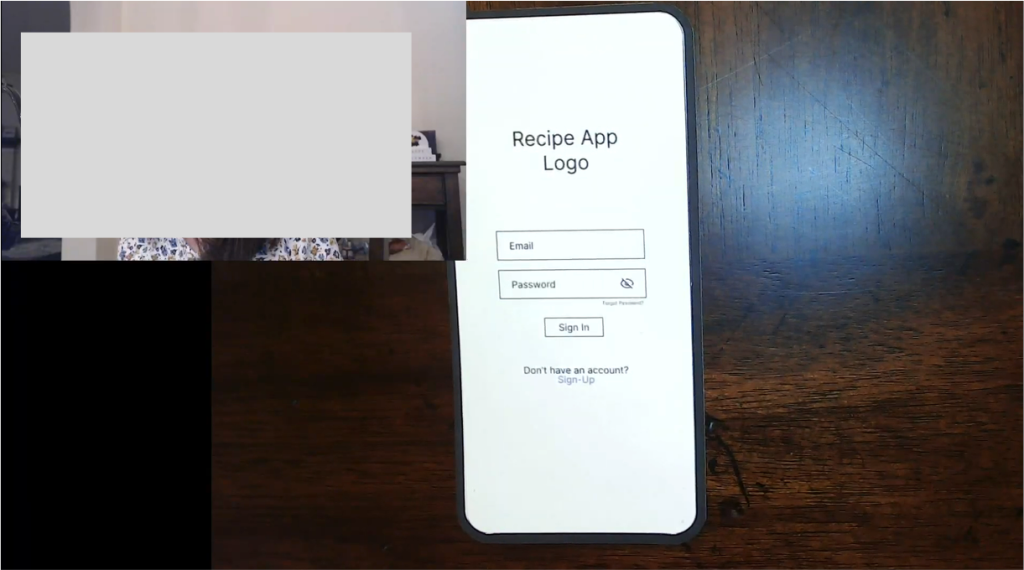
For the test, I had the participant sign up for the app with a given email and password, configure the account settings based on a given persona, search for a recipe that fulfills a set of requirements, add recipe ingredients to the cart, and order groceries from within the app.
Testing
For the test, I set up two webcams on my dining room table, one placed on top of a bottle to record the participant’s face, and another attached to a snake arm to record the prototypes. The face camera allowed me to see the participants’ expressions and reactions during the test and potentially get further insight into confusion or pain points.
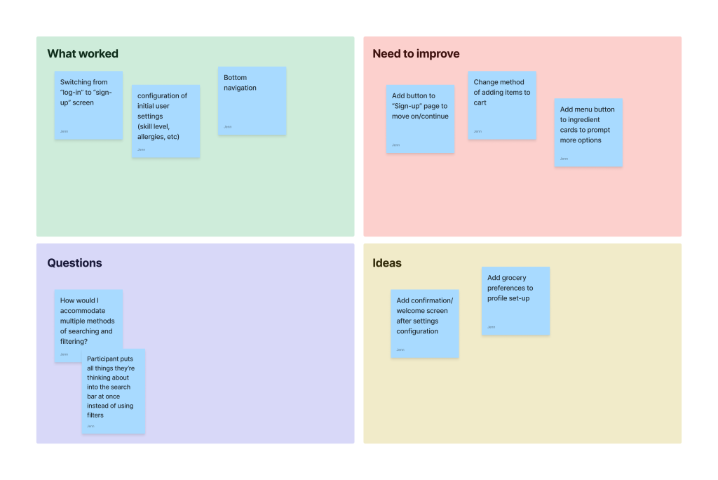
Several things were discovered during the user testing. I organized my notes into a feedback capture grid.
High Fidelity Designs and Testing
Testing Topics Development
I needed more information to draft the final app designs before making certain decisions.
I used a survey to get insight into names for various features, color choices for the app, order of navigation icons, page indicators, recipe cards, typefaces, icon stylization, etc.
Word Choice Questions
When asked which name they preferred for a feature that prevents the phone from falling asleep while cooking, most participants said “Keep Screen On” most accurately described the feature, while “Cooking Mode” was the best-sounding name.
When asked which name they preferred for a text-to-speech feature to read directions aloud while cooking, most participants said “Text-To-Speech Instructions” most accurately described the feature, while “Read to Me” was the best-sounding name.
When asked which name they preferred for saving and keeping various lists for different recipes, most of the participants said “Bookmarks” most accurately described the feature. At the same time, “Cookbooks” was the best-sounding name.
Visual Design Questions
I asked participants to give feedback on the following color choices.
- 9 people rated option B 4/5 for “Friendly”
- 8 people rated option B 4/5 for” Visually Appealing”
- 1 person rated option B 5/5 for “Friendly”
- 1 person rated option B 5/5 for “Visually Appealing”
- 4 People rated option B 1/5 for “Inspiring”
- 8 people rated option R 4/5 for “Friendly”
- 7 people rated option R 4/5 for” Visually Appealing”
- 3 people rated option R 5/5 for “Visually Appealing”
- 6 People rated option R 4/5 for “Inspiring”
Option R is the best fit for the app as it’s more inspiring, visually appealing, and friendly.
When asked about the order of bottom navigation buttons, 50% of participants said they preferred Option J, while 50% preferred Option M.
Since the results are evenly split, I might conduct more testing in the future to figure out which is best.
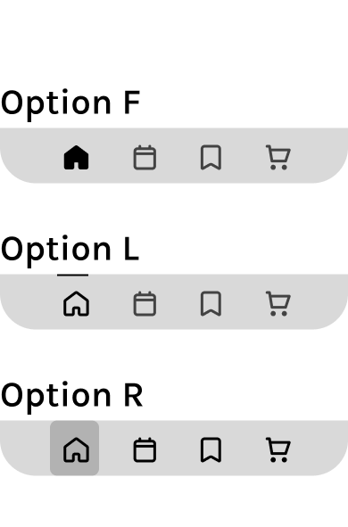
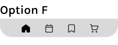
When asked to select an active navigation icon (indicating the chosen page), 62.5% of participants preferred option F, while 25% preferred option L.
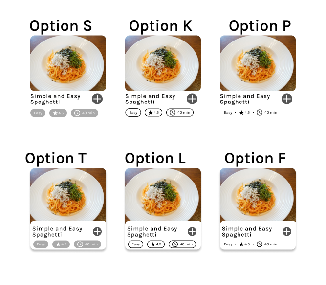
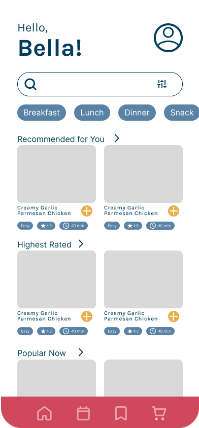
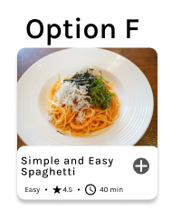
For the appearance of recipes within the app, 43.8% of participants preferred option F. Option L and Option B were also popular, but only got 25% of the votes each.
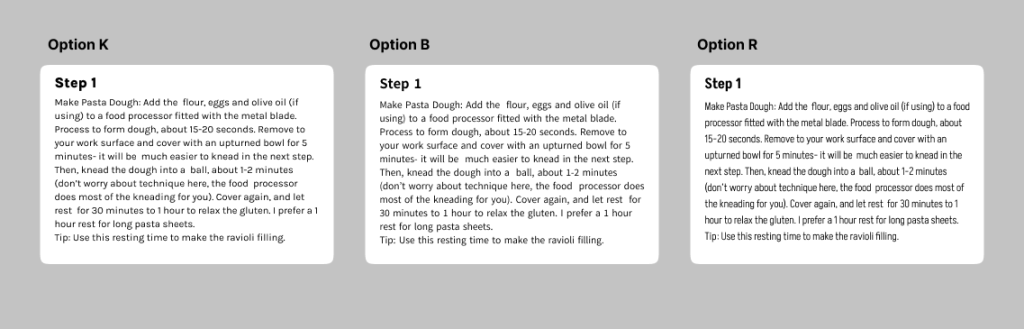
Participants were asked about the typography for the app
For option K, 9 marked it as aesthetically pleasing, 10 marked it as legible, and 10 marked it as readable
For option B, 9 marked it aesthetically pleasing, 14 marked it legible, and 11 marked it as readable
For option R, 9 marked it as aesthetically pleasing, 7 marked it as legible, and 12 marked it as readable
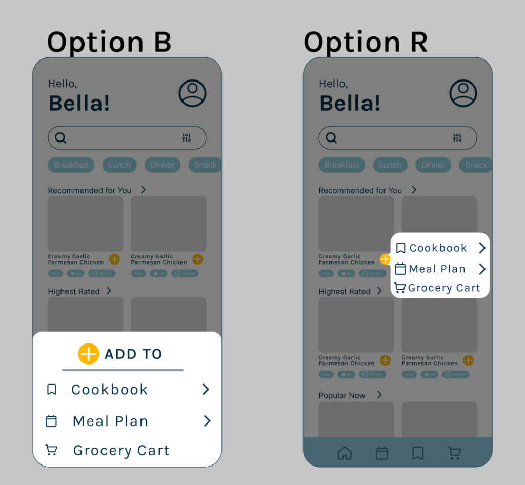
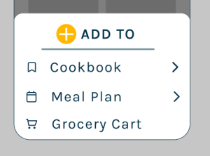
The app is going to have a pop-up style menu.
87.5% of participants preferred option B for the pop-up menu within the app.
Interface Icons
Option M and Option J received the highest rankings, being nearly identical except for Option S receiving one extra point for “The icons seem fitting for a recipe app.”
Overall Findings
Based on participant responses, the following are the final choices for the app’s color, active navigation state, typography styles, recipe cards, pop-up menu, and app icons. The order of the bottom navigation icons is still undecided and will require additional testing.
The color palette with red incorporated was more inspiring and visually appealing.
Participants preferred the active navigation state with the most contrast, with the icon fill.
Participants preferred the recipe card separating the featured image and the recipe information, without the stroke around key details, and with a drop shadow for the whole card.
Participants preferred a smoother and softer-looking icon set with more detail.
Final Thoughts
Next Steps
In the future, with this, I’d need to:
- Redesign wireframes/prototypes to address issues discovered during initial user testing
- Test improved wireframes/prototypes to confirm that initial problems were addressed and discover any potential new issues.
- Design wireframes/prototypes for additional features
- Test those wireframes/prototypes
- Refine those prototypes
- Test again (repeat as needed)
- Style and refine prototypes based on survey findings
- Create a final high-fidelity prototype
I’m unsure if I will ever have this app fully developed, but I still want to create final designs and continue testing and research to get more experience with user testing.
Conclusion
This project’s biggest challenge was getting participants for testing and surveys. I bribed my coworkers with the promise of free pizza to get most of my needed responses. I learned that user testing and surveys require an investment to get people interested in participating, which can be extremely difficult for small projects without a budget.