Revitalizing Diversity Education
TheOMBS.org is a website that accompanies The Ouachita Mountain Biological Station, a suite of facilities for those researching and learning about the biodiversity and environment in the Ouachita Mountains. Attracting students and educators to their facilities was a challenge. The old website suffered from an outdated design, lacked an understandable organization, and did not meet ADA compliances. The goal was to address all of those issues and provide new branding elements. My UX work on this project included: user research, current state analysis, card sorting, tree testing, draft sketches, wireframe development, logo and style guide design, and a high fidelity still for the home page.
The current website has several issues:
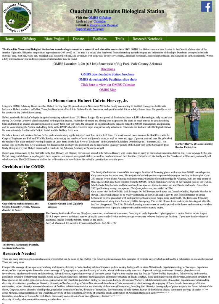
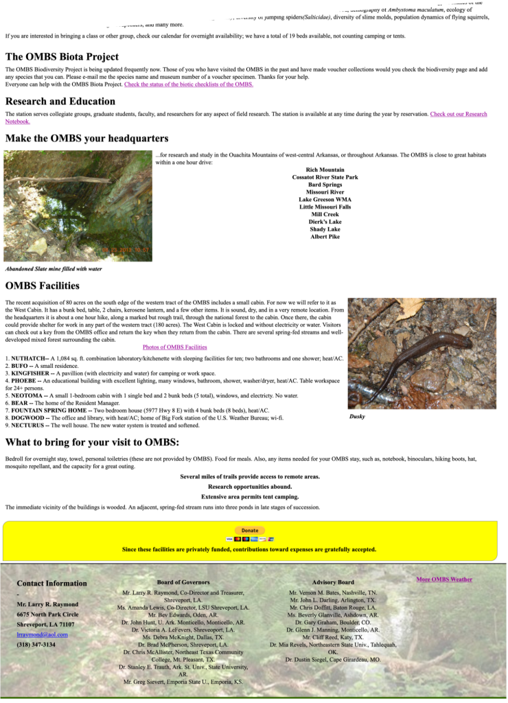
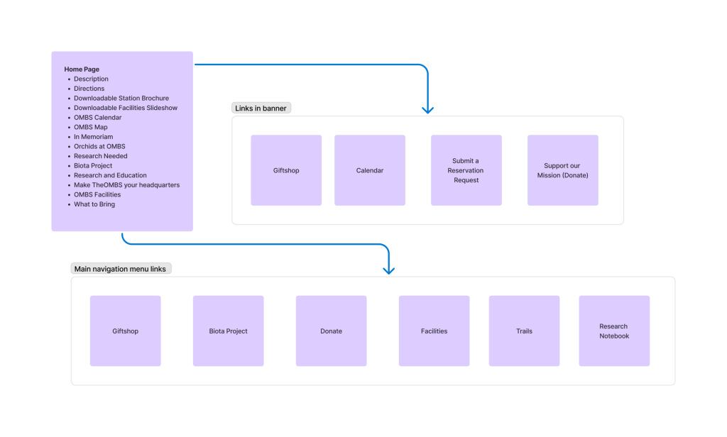
This is the current home page for TheOMBS.org
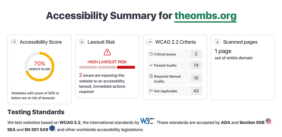
As the website currently stands, it fails several basic accessibility checks
The website also contains very unorganized navigation and information architecture.
The home page has two navigation links, one in the banner and another in the navigation bar. The home page also contains much information that might fit more on other pages in the navigation.
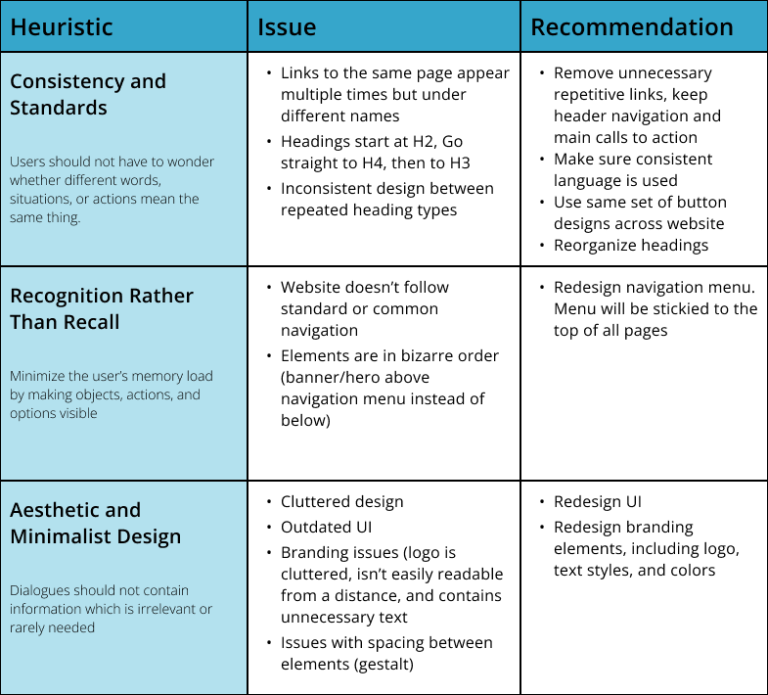
I completed a brief heuristic evaluation of the website to help understand and demonstrate key issues that need to be addressed.
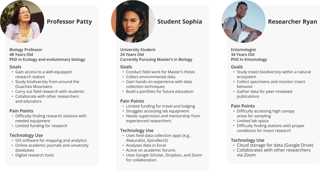
The website’s intended demographic is students, professors, and researchers looking for a place to conduct biological field research.
I created abridged user personas for this project: One for professors wanting to complete field research for students, one for students wishing to complete field work for their degree, and one for general researchers.
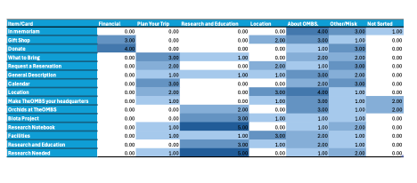
I performed an open card sorting test using KardSort.com and obtained eight responses.
From the responses, I combined similar categories and created a table from the data.
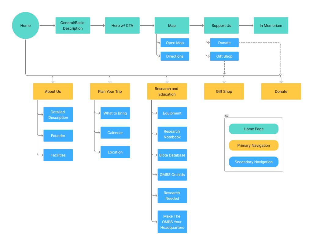
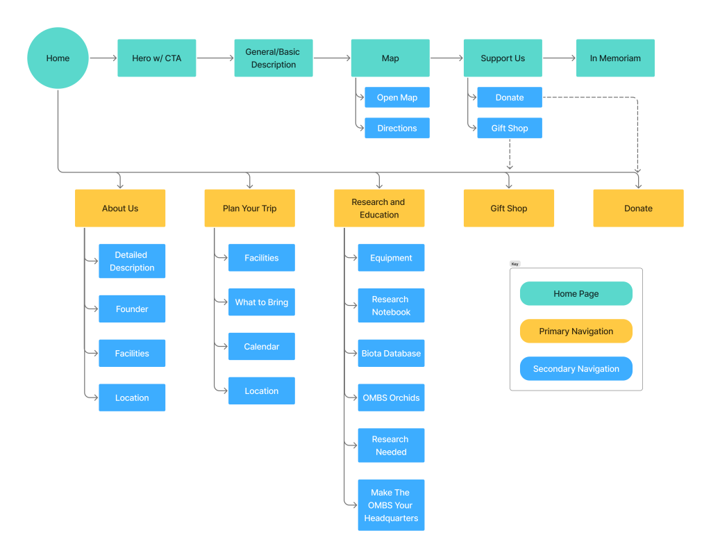
I used the results from the card sorting as a guide for drafting a site map. The main change was isolating “Donate” and “Gift Shop” Into their own parts on the main navigation menu and making “Location” a sub navigation link under “Plan Your Trip.”
This site map was tree tested using a free trial of maze.co. Based on the findings, I decided to put “Facilities” and “Location” under multiple main navigation links to take more users into consideration.
I drafted low-fidelity wireframes of the home screen in Figma.
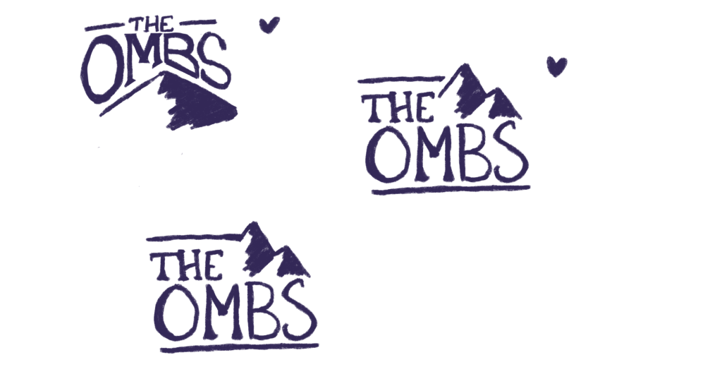
I drafted several logo sketches for this project.
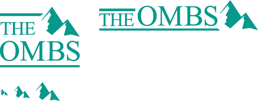
I chose my favorite from these sketches, and I also asked peers for input to make a final decision. I digitalized my final choice and put together a logo set with a horizontal version and several favicons.
Since this is a non-profit with a low budget, I used the font that is already being used for their logo and website. This allows us to avoid any licensing issues.
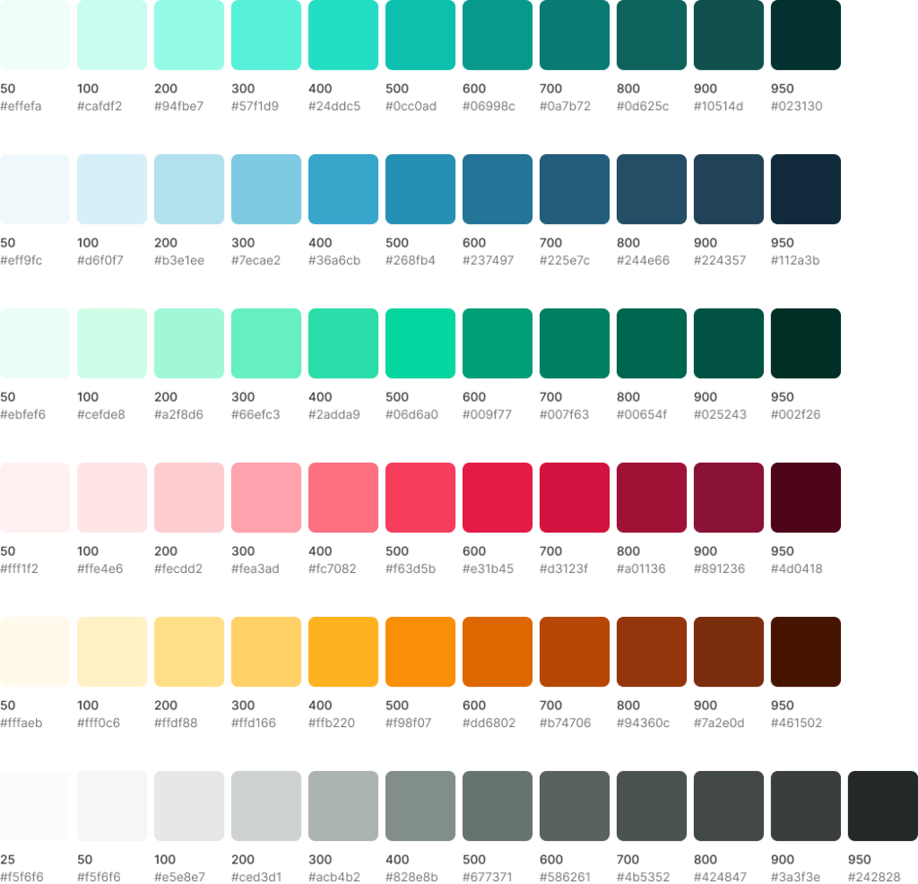
For the color palette, I chose a teal color for the primary branding color and based my surrounding colors accordingly. I selected a blue “information” color, a green “success” color, a red “error” color, and a yellow “warning” color for the website. I created scales for each color and also created a scale for neutrals. I’ll be able to make more adjustments as I work on designing more of the website, but this set of scales gives me a lot to work around with.
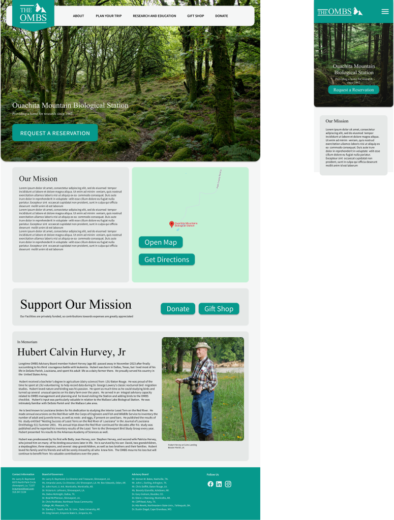
I incorporated the branding elements into the wireframes for a high-fidelity home screen.
This provides a good starting point for designing the rest of the screens.
My biggest challenge during this project was a lack of proper research methods. This is an unsolicited redesign for an organization run by my extended family, completed during a short time frame, so I was unable to interview the client for more profound insight, and I was also unable to interview users to develop personas based on. I had to blindly walk forward using information I found online and my own experiences with the location, which wasn’t ideal.
Another challenge of this project was dealing with an actual client. I was stressed about how the client might react to my work. However, I found it easier to stay motivated knowing this design was more likely to be used in the future.
Now that I have design work to show the client, I hope to use it as leverage to collaborate further to fully refine their brand and website.
Currently, I need to: